How to Restaurant Menu Cover Design That Reflects Your Brand
Guests form an impression of your restaurant within seconds of sitting down. Before they read a single dish, they touch your menu cover. That cover is not a functional object — it's a statement about who you are. Yet most restaurant owners spend months choosing the right plates and forget to give the menu cover the same attention.
Designing a menu cover that actually reflects your brand is less about aesthetics and more about alignment. The cover needs to speak the same language as your interior, your lighting, your staff uniforms, and your price point. This guide walks you through exactly how to get that right.
Why the Menu Cover Is a Brand Touchpoint
A brand touchpoint is any moment when a guest interacts with your identity. The menu cover is one of the earliest physical ones — it arrives at the table before the waiter comes back with water, and guests have nothing else to do but look at it and feel it.
Research from Cornell's hospitality school has shown that menu design significantly influences spending behavior and helps shape the dining experience for customers and diners. The physical quality of the cover alone signals price expectations: a flimsy laminated folder tells guests they're in a budget spot; a heavy wooden board or a stitched leather holder tells them they're somewhere worth spending.
That signal should be intentional, because the cover also helps create a lasting impression. Your menu cover design is a chance to anchor the right expectation before the meal begins.
Define Your Brand Language First
Before thinking about materials or colors, choose or select three adjectives that describe your establishment. Not what you aspire to be — what you actually are when the room is full and everything is working. Common examples:
-
Warm, rustic, neighborhood bistro
-
Sleek, minimalist, modern European
-
Industrial, casual, craft beer bar
-
Romantic, intimate, fine dining
Each of those descriptions translates into specific material and design choices. The cover should pass a simple test: if a guest who had never visited you picked up the menu cover on a shelf, they should be able to guess the kind of restaurant it came from, and whether it fits the restaurant's style and atmosphere.
Menu Cover Material Choices and What They Communicate
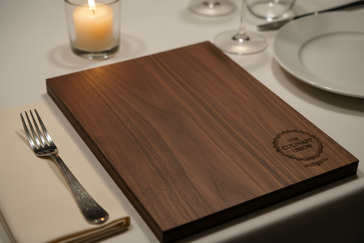
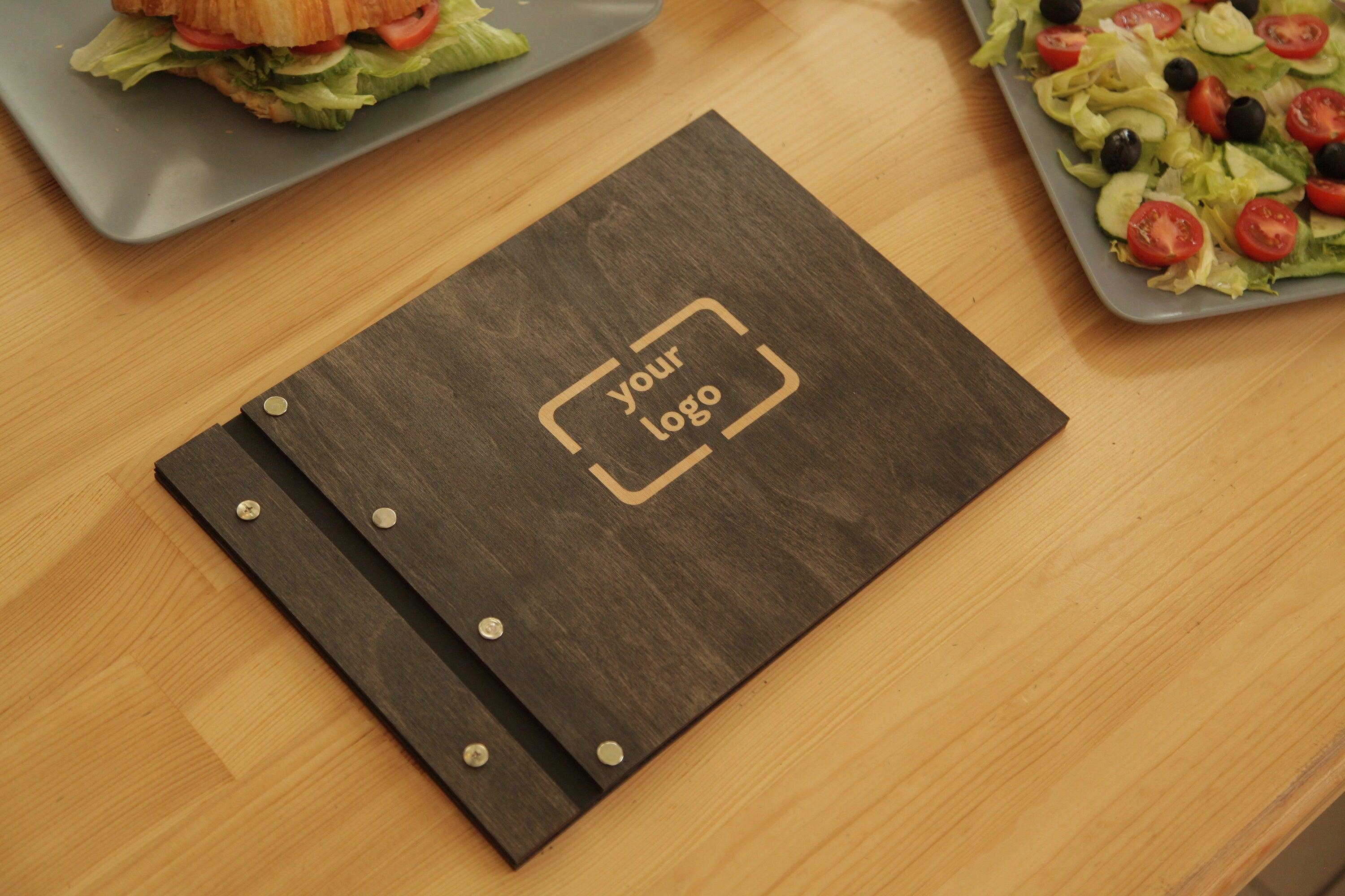
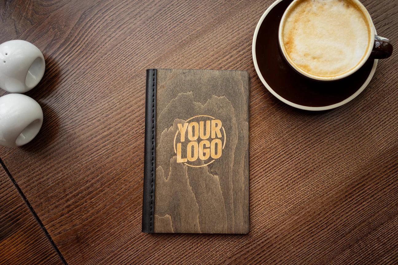
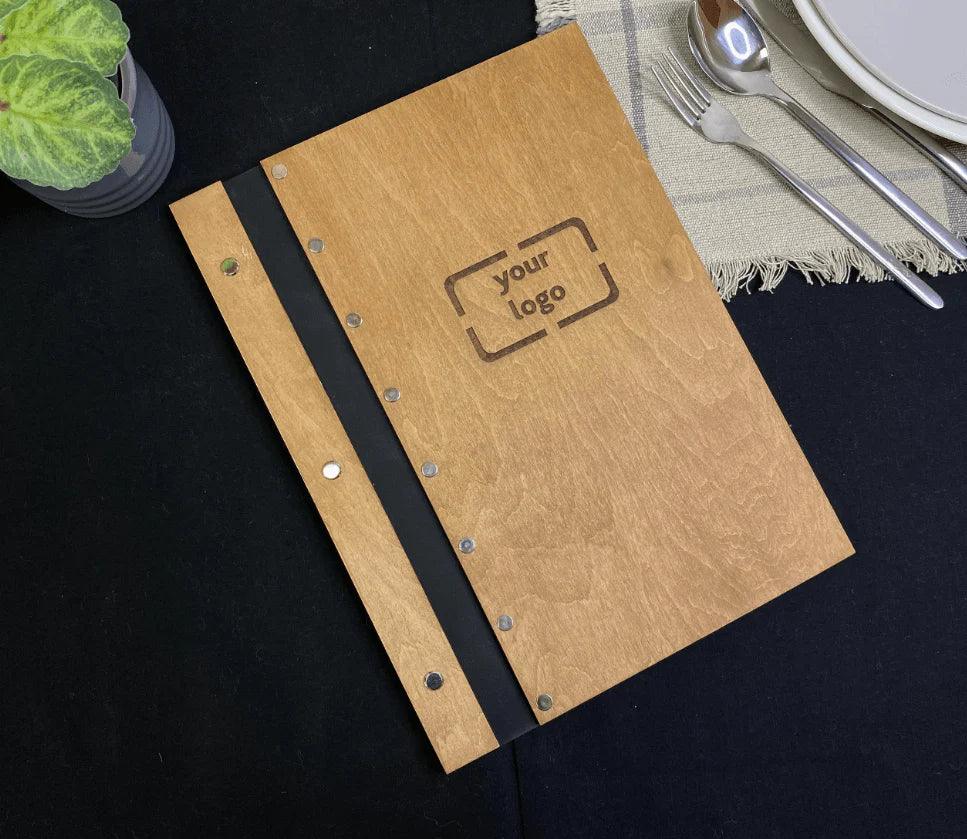
Wood
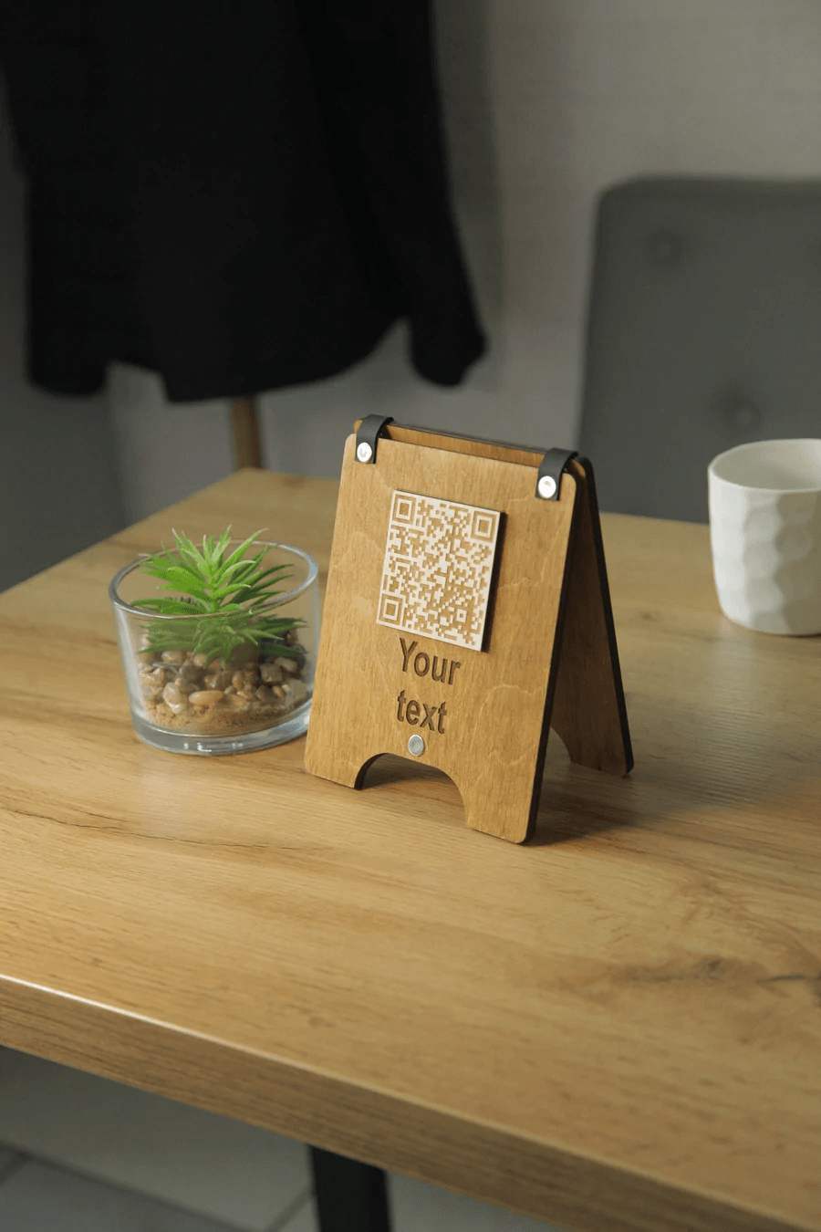
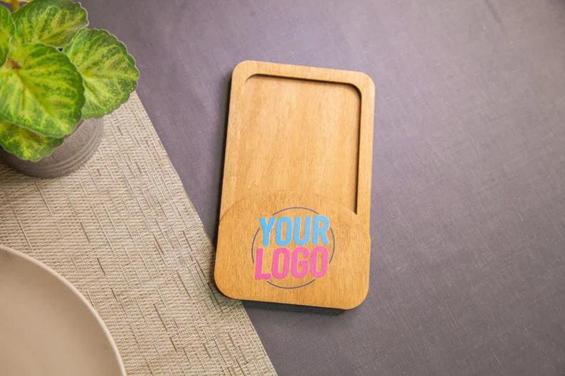
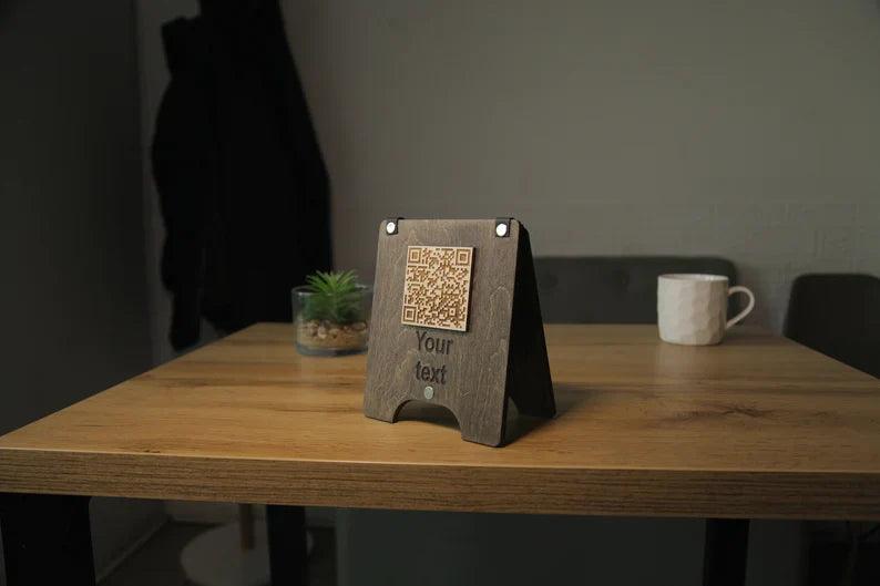
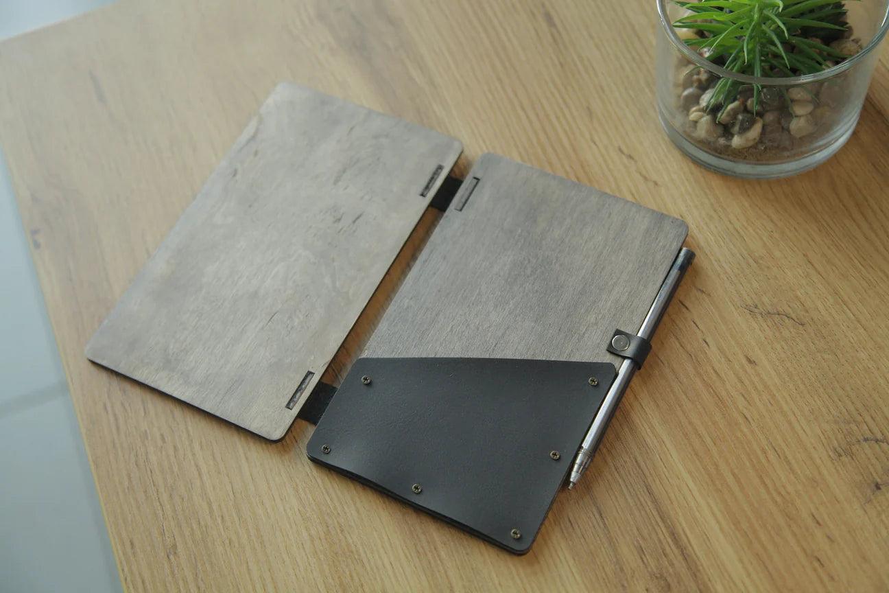
Natural wood — walnut, oak, pine — reads as artisanal, warm, and honest, making it an ideal choice for restaurants that want to showcase food in a warm, honest way. It works exceptionally well for farm-to-table concepts, where it can complement the ambiance, as well as craft breweries, casual brunch spots, and restaurants where the chef's sourcing story is part of the brand. Wood ages gracefully and develops a patina over time, which adds authenticity. Laser engraving makes it easy to add logos and details while helping protect menu pages without paint or stickers.
Leather
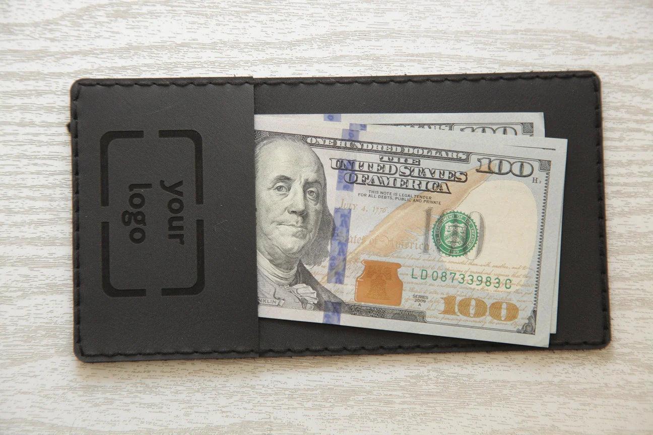
A leather menu cover is a stylish, durable, excellent choice for steakhouses, fine dining rooms, upscale hotel restaurants, and other premium venues. It's perfect for concepts that want to elevate the guest experience in a way that feels considered and refined. Dark brown and black leather reads classic; cognac tones read contemporary. Stitching details and the option to emboss a logo alongside embossing add visible craftsmanship.
Acrylic and Metal
Clear or frosted acrylic feels modern and clean, and it’s a strong option for a café following a more contemporary trend. It suits minimalist interiors and Japanese concepts. Metal — brushed aluminum or black powder-coat — leans industrial and is common in urban bars and fast-casual spots that still want a premium finish, especially when menus need frequent update changes and practical holders.
Logo Placement and Typography
If your brand has a logo, the menu cover is the right place to feature it clearly and create a more obvious brand signal on the cover. A few rules that hold across formats:
-
Center placement works for formal, symmetrical brands. Off-center or bottom placement reads more modern and editorial, so placement should match the overall atmosphere or brand presentation.
-
Engraved or debossed logos look more expensive than printed ones, and different finishes help reinforce that premium look through texture and craftsmanship.
-
Avoid putting too much text on the cover. Name and logo only. The cover is not the place for your tagline or social handles.
-
Font choices should match your interior signage and printed collateral exactly. Inconsistency is noticeable.
Matching the Cover to Your Interior Style
Interior designers talk about material continuity — the idea that the same materials and textures appear across a range of surfaces, and your menu cover options should support that cohesion. Your menu cover is part of that system.
If your tables are reclaimed wood with metal legs, the right wooden menu cover with metal hardware helps match the atmosphere of the room and leaves a stronger impression on customers. If your interior features white marble, leather menus with clean lines feel aligned. A neon-lit cocktail bar with exposed brick calls for something tactile and bold — thick card stock in a custom sleeve, or a dark wood board.
Walk through your dining room before ordering covers and ask: what materials do guests touch most? Chairs, tables, napkins, glassware. Your menu cover should feel like it belongs in that same tactile world, so explore materials that feel right for the space.
Durability and Practical Considerations for the Perfect Menu Cover
Quality materials help protect the menu and keep covers durable over time, so a beautiful cover that warps, stains, or falls apart after three months is worse than no design effort at all. When briefing a supplier, ask about:
-
Resistance to moisture — especially relevant in bars and outdoor seating
-
Wipe-clean surfaces for high-turnover casual restaurants
-
Insert systems — menus need to be updated seasonally, so choose covers that make it easy to swap pages or refresh featured dishes
-
Edge protection on wooden covers to prevent chipping
A practical detail that often gets overlooked, especially for establishments that replace covers often and may need wholesale options: menu size. Your cover dimensions need to match your printed menus exactly. Brief both the printer and the cover supplier at the same time to avoid costly mismatches.
The Brief You Should Send to a Custom Menu Covers Supplier
When ordering custom menu covers, suppliers may offer a range of options, so provide at minimum and contact support before production:
-
Interior photos — so the supplier understands the environment
-
Your brand color codes (hex or Pantone)
-
Your logo in vector format (.svg or .ai)
-
Menu insert dimensions (page count and paper size)
-
Quantity and expected replacement frequency, including whether you need wholesale options
-
Any specific material preferences or exclusions
The more context you give, the better the result. A good custom supplier isn't just manufacturing — they're helping you translate a brand concept into a physical object that guests will handle dozens of times. Give them the full picture.
Your menu cover is a small investment compared to kitchen equipment or interior renovation, but its impact on first impressions is disproportionately large. A supplier can help you create the perfect menu cover for your establishment by getting the material, finish, and logo right. Contact them early to enjoy a smoother process and a more consistent brand signal every time guests sit down.

